Vacation Rental · Web Design
● LIVE2025Osoyoos Vacations
Dual-property luxury rental showcase for Osoyoos, BC. Each property gets its own full-screen hero, bespoke color palette, and gallery — all under one unified brand with a mobile-first booking experience.
Visit Live Site ↗2
Properties
70+
Gallery Images
97
Lighthouse
14 days
Build Time
Overview
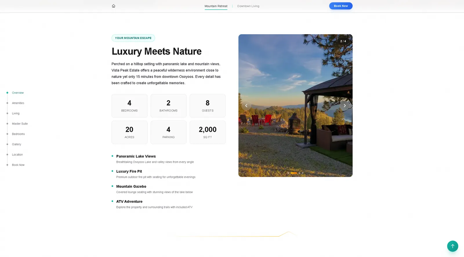
Vista Peak Estate manages two distinct luxury vacation rentals in Osoyoos, BC: Vista Peak, a 20-acre hilltop mountain retreat with panoramic lake views, ATV access, fire pit, and gazebo; and Aisha's Jewel, a contemporary downtown townhome with a rooftop lounge, soaker tub, and modern finishes. The challenge was giving both properties a premium, distinct identity while keeping them under one unified brand.
The Challenge
Most vacation rental sites are either Airbnb embeds or generic template sites. Neither is what a premium property deserves. Vista Peak needed to feel like a wilderness escape — teal, natural, calm. Aisha's Jewel needed a warmer, urban energy. The site had to handle both without either feeling like an afterthought, while also managing a 70+ image gallery per property and mobile-first booking flow.
Our Approach
We built a property-aware theming system: the landing page presents both properties as full-screen parallax cards with distinct colour identities. Clicking into Vista Peak enters a teal-accented world with mountain divider SVGs, a scroll nav, and section-by-section storytelling across amenities, living spaces, master suite, bedrooms, and a filterable gallery with 70+ images. The gallery component supports category filtering (exterior, interior, amenities, views) and autoplay. Vercel Analytics and Speed Insights are wired in for ongoing performance tracking.
The Result
A luxury vacation rental site that actually feels luxury. The dual-property architecture is clean and scalable. The gallery and scroll nav make both properties genuinely explorable. Properties that previously relied on Airbnb alone now have a dedicated booking surface with full brand control.
The Properties
Two identities, one brand.
SCROLL-DRIVEN STORYTELLING
A Property Walkthrough, Not a Brochure
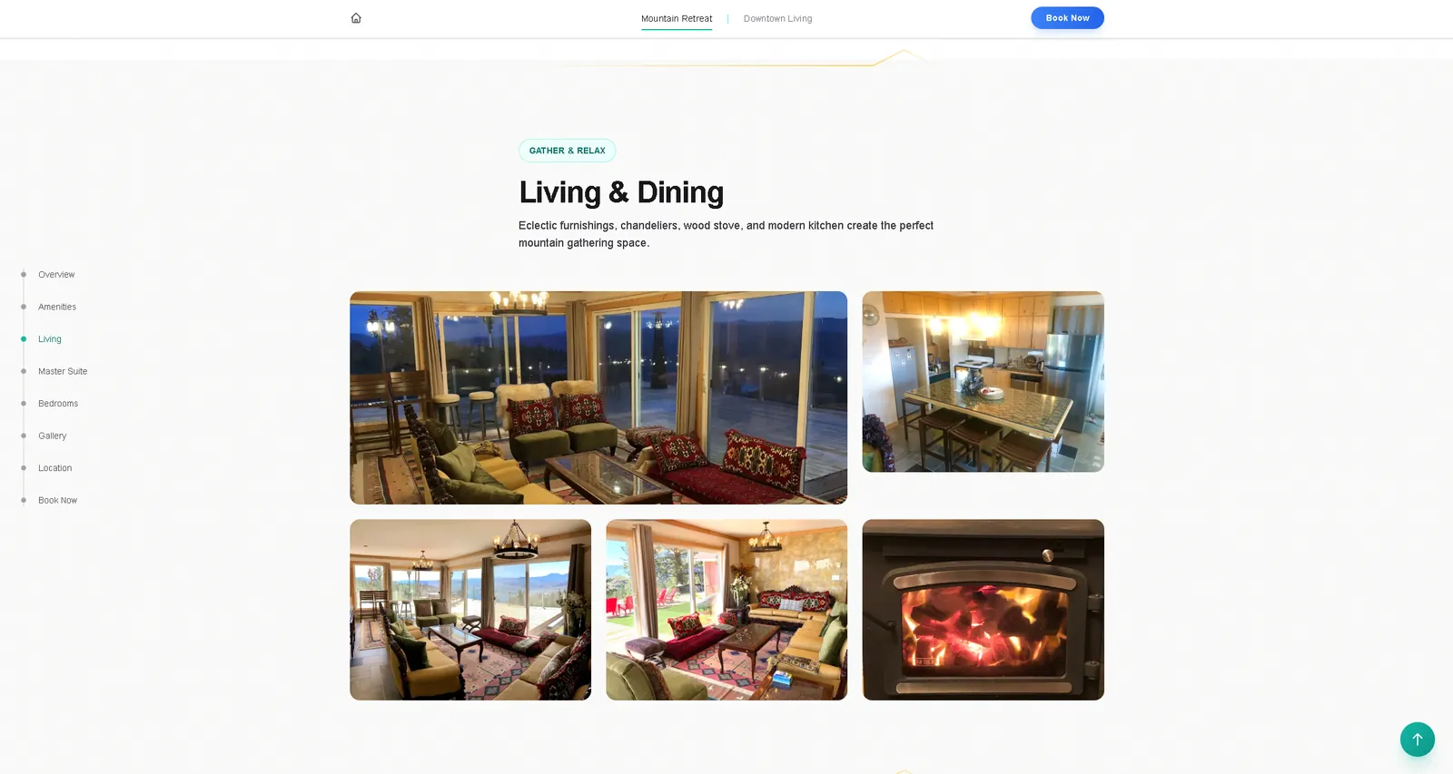
Luxury rental decisions are emotional first, logical second. The scroll nav — Overview, Amenities, Living, Master Suite, Bedrooms, Gallery, Location, Book Now — guides visitors through the property the same way a real walkthrough would. Each section gets dedicated photography and copy that sells the experience, not the specs. The Living & Dining section specifically addresses a major booking objection: will it actually be comfortable for a group? Floor-to-ceiling mountain views, a wood stove, chandeliers, and real furniture answer that before the visitor thinks to ask.
FILTERABLE MOBILE GALLERY
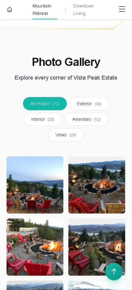
72 Photos, Zero Overwhelm
Gallery design is a conversion-critical detail for vacation rentals. Dumping 72 photos into a flat grid creates scroll fatigue and decision paralysis. The category filter — All Photos (72), Exterior (30), Interior (20), Amenities (12), Views (29) — lets each visitor self-direct. Someone who booked for the views goes straight to Views. A family evaluating for a trip checks Amenities first. On mobile, the 2-column grid keeps images large enough to feel premium while fitting thumb-scroll behavior. The floating scroll-to-top button is a usability requirement on a gallery this size — most rental sites miss it.